
Transforming the traditionally print-forward National Geographic Learning academic platform into digtal-first experience, with consideration for how K-2 learners think, read, and interact with technology to help adoption across states, schools, and students. Creating the project narrative website for sales and internal adoption. Introducing scalable UX practices, design systems and voice guides, and cross-functional workflows within the organization.
Senior Product Designer & Copywriter
Education Technology
8 Months
UX Strategy, UX Copywriting, User Research, Information Architecture, Design Systems, Visual Design, UXQA, DesignOps
Successfully Launched
Challenge: The K-2 platform wasn't designed around how young children actually learn. The content was shoe-horned into the same interface that college students used. Because of this, instead of focusing on the lesson, young students spent valuable cognitive effort figuring out how to navigate the interface. The experience created unnecessary friction, making learning less intuitive, less engaging, and ultimately less effective. Additionally, the organization was traditionally a print-first environment so design and copywriting standards did not support future product and team growth.
Business Need: The org needed a more intuitive learning experience that better supported state and classroom adoption, as well as helped them realize their investment in digital products, while also establishing scalable UX processes that could improve future product development.
User Need: Young learners have unique cognitive, motor, and reading abilities that significantly influence how they navigate digital experiences. Their early experiences with their learning curriculum can shape their entire lives. We as an organization needed to learn--through research, classroom observations, teacher feedback, and usability testing--how to simplify navigation, reduce cognitive load, and create an interface that encouraged confidence and independent exploration.
As one of the first Senior UX Designers at Nat Geo Learning, I owned the end-to-end design process from conception to implementation, including all standard UX deliverables + new UI design system and voice and tone guide, and I established UX practices that improved collaboration between design, product, engineering, and curriculum teams. Additionally, I created the road show website to help align internal teams and state adopters.
K–2 students are in the early stages of developing reading comprehension, motor skills, attention spans, and digital literacy. I believed that designing specifically for these developmental needs—not merely adapting adult interfaces—would create a simpler, more engaging, and more effective learning experience. And, I believed that creating and evangelizing optimized and unified workflows and tools, we could meet our goals faster and more effectively.
Research & Discovery: Understanding the Pyschology of Young Learners
Before exploring interface concepts, I worked to understand the educational and pedagogical landscape.
My research included competitive analyses of educational platforms, classroom observations, interviews with internal stakeholders, reviews of child development best practices, and an evaluation of how teachers and students interacted with existing digital learning products.

User Feedback & Validation
We validated our concepts directly with teachers and students. If you've never evaluated designs with six year olds, you've missed out on a lot of fingers up noses and occasional tears, but sometimes you get to witness an excitement for learning that's pretty magical.
Despite the unique challenge of the age of our testees, my interactive prototypes allowed us to evaluate usability, clarity, engagement, navigation, and age appropriateness while identifying friction points early in the design process.

Design System & Software Foundations
From research I conducted about way young learners interpret colors, type, and words, I created a new K2 UI design system -- and I worked with engineering teams to establish the live Storybook UI Design Library. The system reduced inconsistencies and saved designer and engineer time and company money.
It also included larger and more readable font, bright and fun colors, more literal icons, clear affordances for buttons and forms, and more -- which tested well with students and teachers. I also had the opportunity to put my copywriting skills to use: copy refinement was vital to our users' comprehension to better align with the reading level of this age group.
Once the design system was complete, I implemented our kit into Abstract, a version control software. Abstract helped us better manage the UI library, track changes, and ensure consistency across usage. I then provided courses and documentation to train the organization on the Abstract platform.

Voice & Tone Guide
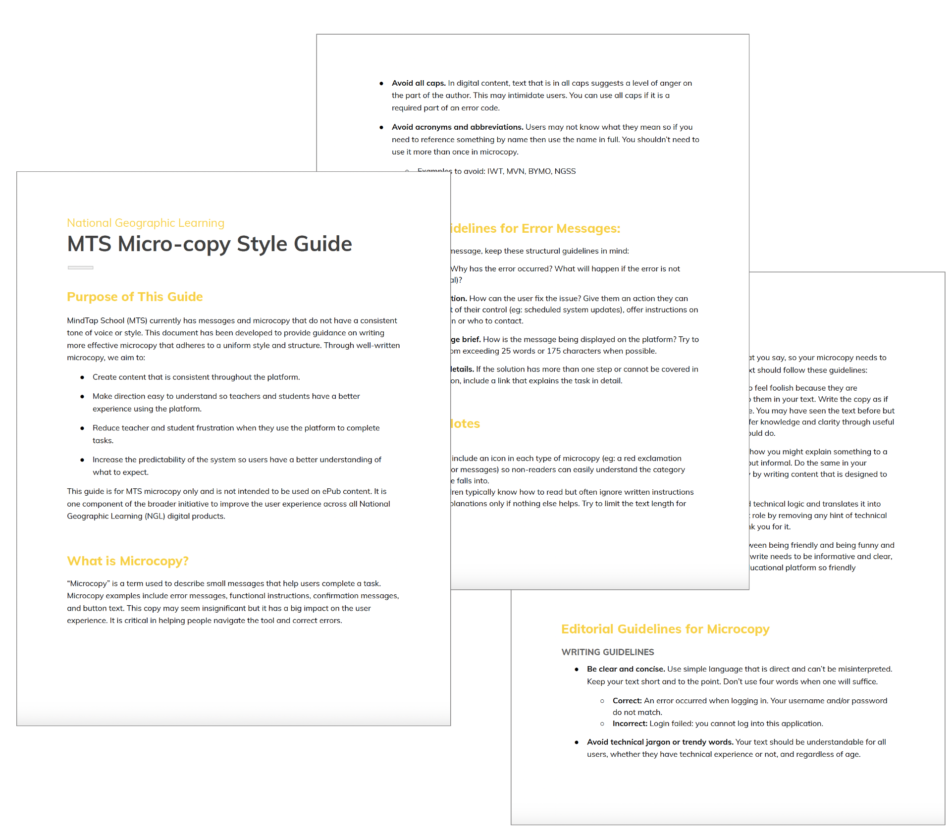
Copy, voice, and tone refinement was vital to our young users' interaction and ncomprehension. Because we had not retained a UX Writer on staff, I had the opportunity to put my writing skills to use.
I worked with teachers, students, and Nat Geo Learning editors to create our K2 Voice & Tone Guide and to write UX copy for our platform experiences.
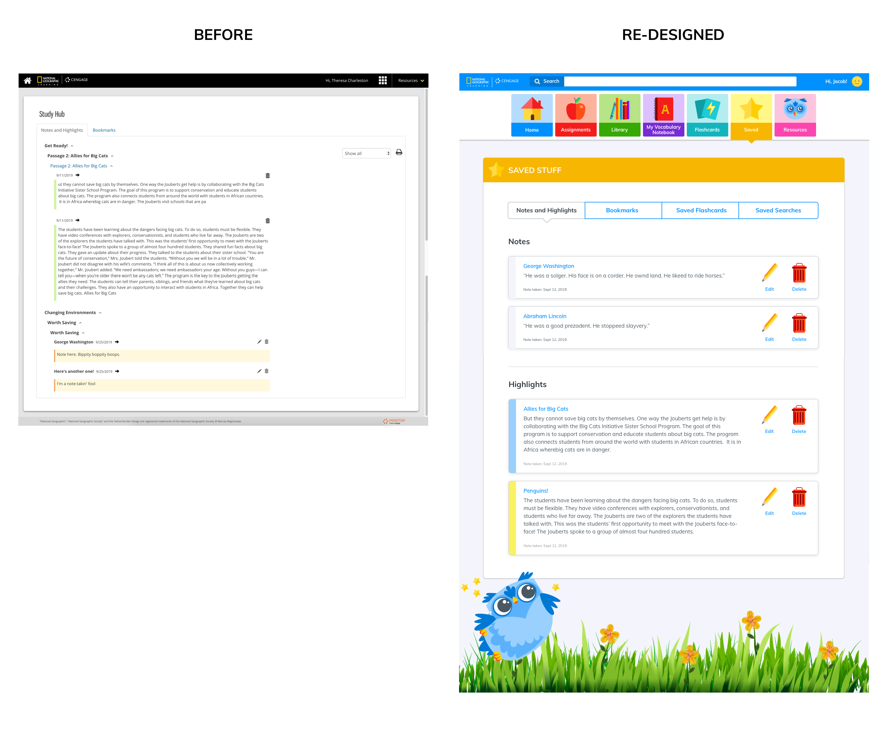
To meet the needs of younger students who have a generally shorter attention range, I simplified the information architecture, streamlined user workflows, revamped the visual language and hierarchy to help students focus on learning rather than figuring out how to use the interface.

I also had the pleasure of creating the curriculum mascot, whom I fondly named "Hooty". Hooty the learning owl was a friendly guide who accompanied students through their lessons.
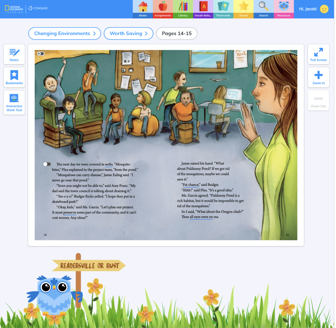
Early Student-Optimized Navigation
Young people are affected differently by colors, words, and movement. I optimized navigation, using more literal icons (because children don't tend to comprehend abstract concepts), bright and engaging colors to enhance student attention, more readable typography, and larger and more vibrant touch affordances to increase their desire to touch what they saw.

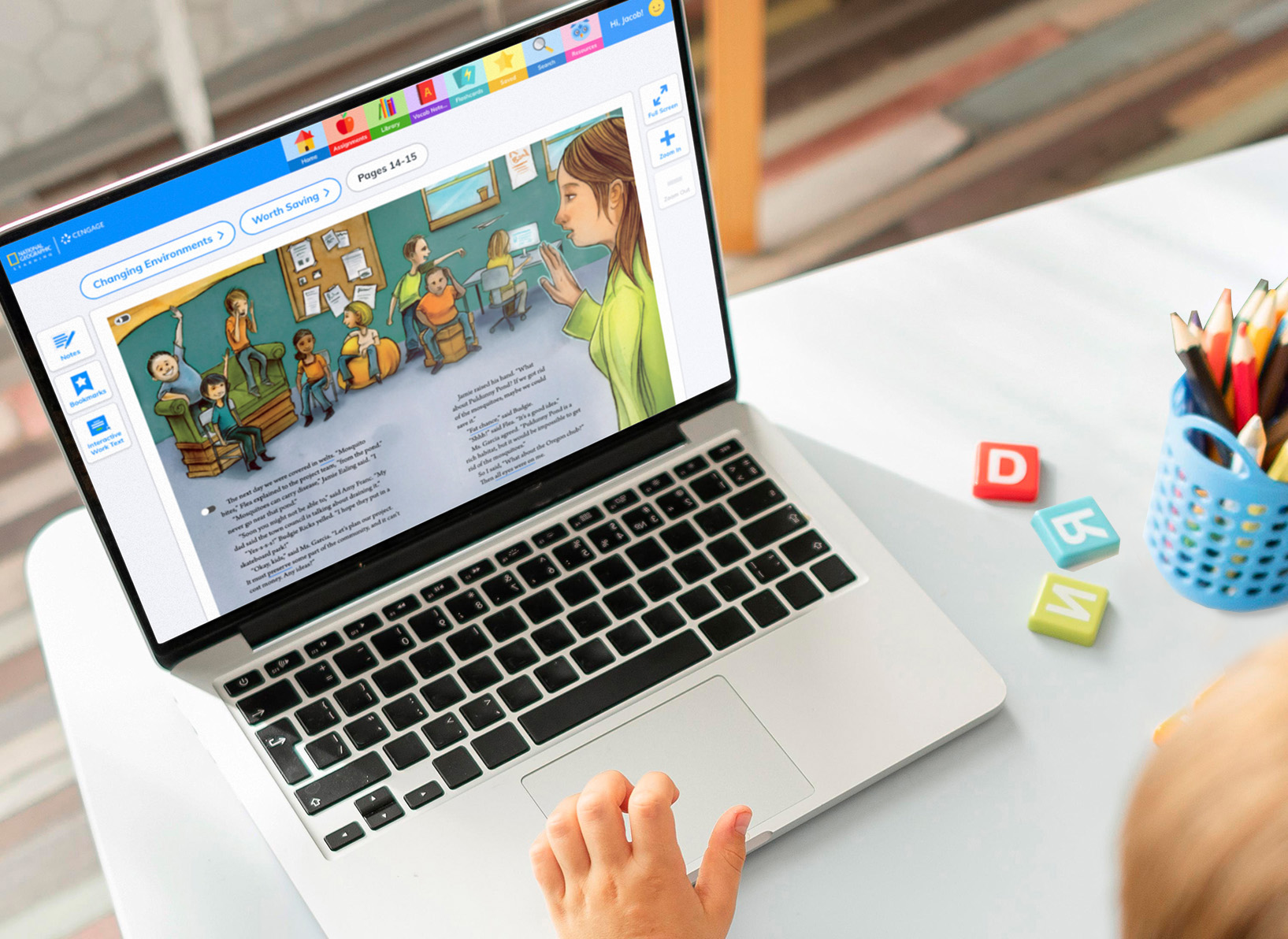
Responsive and Ready
Designs were optimized for all primary classroom device types, even including class televisions. This was especially vital for alignment with state compliance regulations and the varied pedogocical needs of teachers across the country.
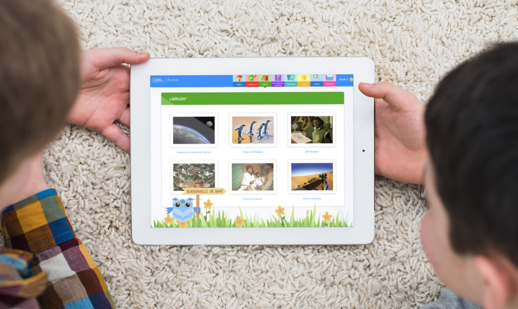
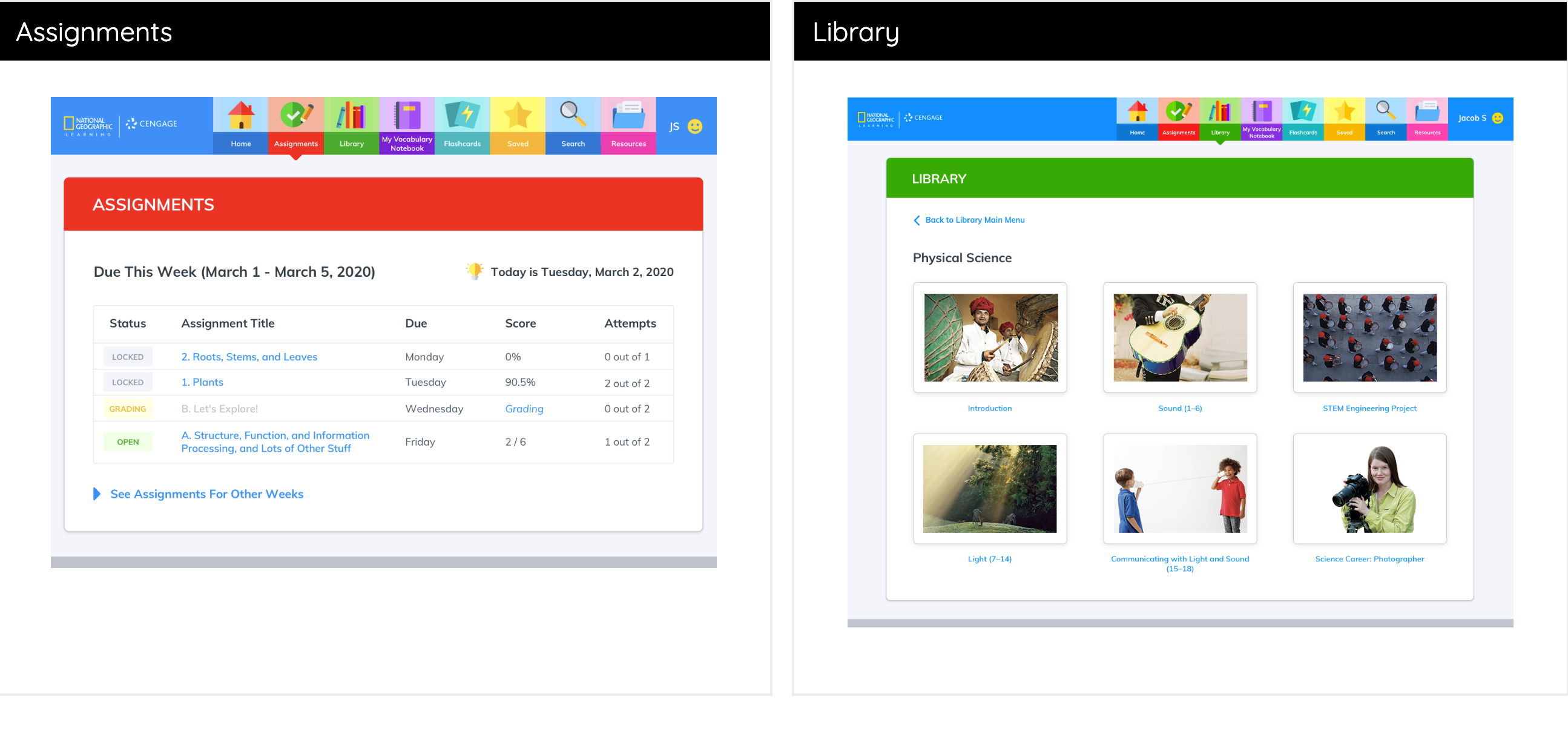
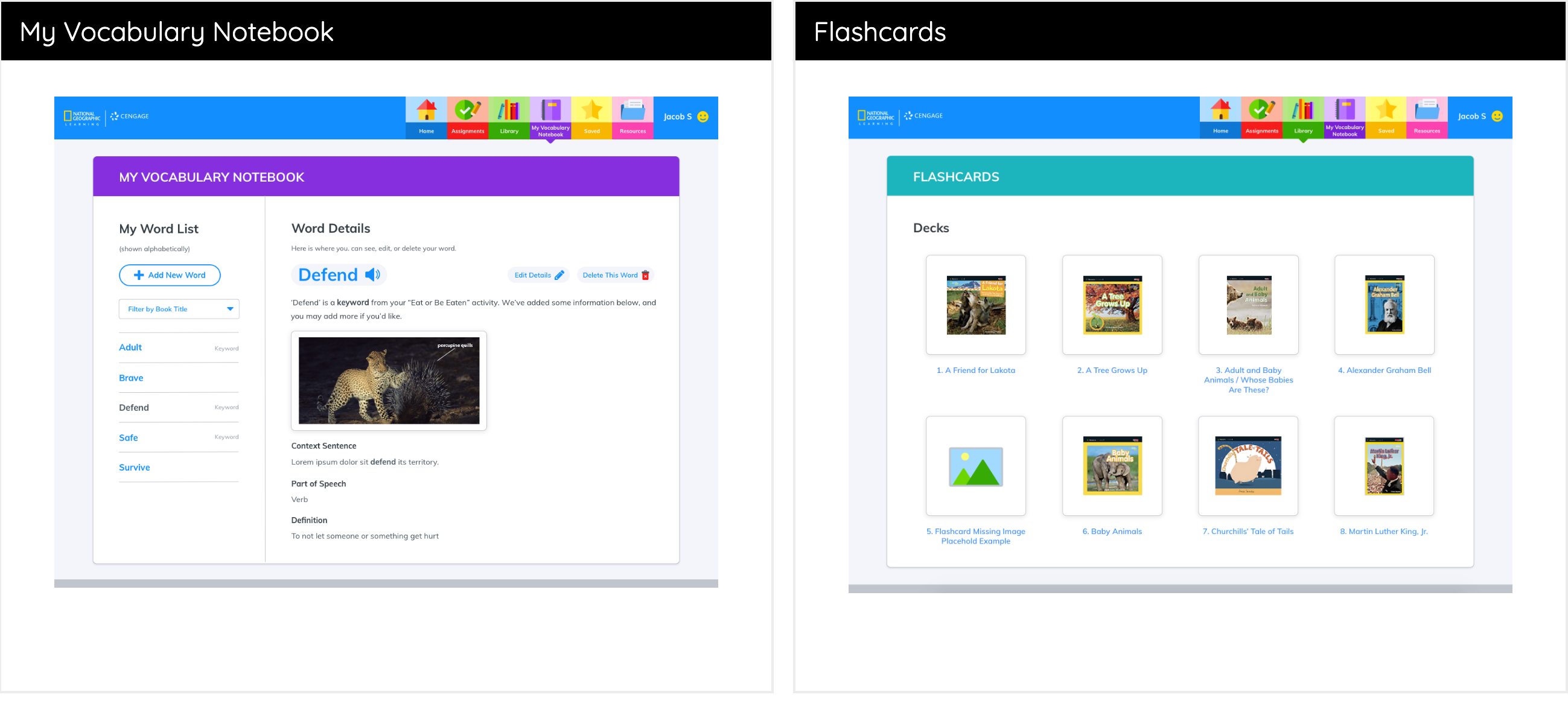
The Suite of Features
I designed the entire platform of functions, including digital libraries, lessons and homework, searching and saving, flashcards, reading and vocabulary, profile, navigation, notes, calendar, and more.



Creating a Shareable Project Narrative
We needed a compelling way to communicate the vision, strategy, and progress of our K–2 Site Overhaul to senior leadership and school districts, helping build support for our newly adopted user-centered design principles and processes. I designed, wrote, and developed the roadshow website in close partnership with Art Director Scott.

View NGL K2 Project Website >
Building UX Into the Organization
The redesign also became an opportunity to improve how design happened across the organization. I introduced design workflows, documentation, version control, collaborative tools, design reviews retrospectives, and reusable processes that helped operationalize UX within the organization. These improvements enabled more consistent collaboration between design, product, and engineering while creating a stronger foundation for future projects.

The redesigned platform successfully launched and established a stronger foundation for National Geographic Learning's digital products. State adoptions increased (amount unknown) and validation testing as well as teacher and student feedback showed hugely positive results. Because of company restructuring, we were not able to assess post-launch data beyond this.
The initiative also helped mature the organization's UX practice by introducing scalable design and writing standards, improving collaboration across teams, and demonstrating the value of research-driven, user-centered design throughout the product development process. This was evidenced through increased speed to launch, internal employee surveys, partner feedback interviews, and during Annual Review findings with my Creative Director.
View Testimonial from National Geographic Creative Director >
.png)


